Restyling this blog as a boot log
In the previous post I added more CI checks to this blog: astro check, html-validate, and lychee. The point was to make the site safer to change before I started touching most of the templates and CSS.
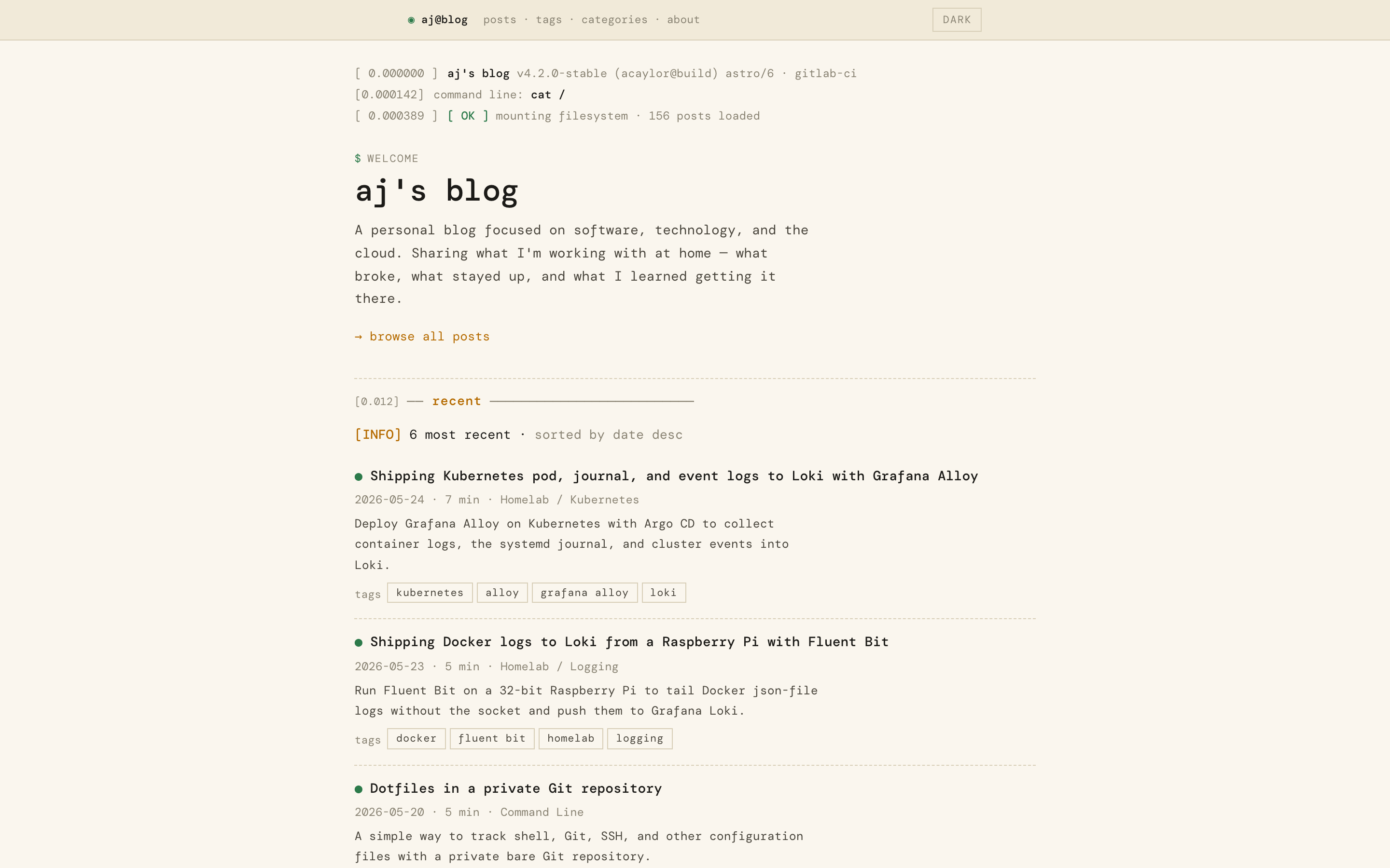
This post is the change I was preparing for. I restyled the blog from a generic “AI slop” layout into a dmesg / boot-log inspired design.
Why change it
The first Astro version was intentionally plain. It used a system font stack, card grids, rounded corners, soft shadows, and a restrained light / dark theme. That was a good first step after the Hugo migration because it proved the new Astro structure worked.
It also looked just like a clone of apple.com
Most of what I write about here is Linux, Kubernetes, observability, homelab systems, CI, and developer tooling. A boot-log treatment fits the subject matter better than another polished card layout. The new design is louder, but it is more specific to the site.
The visual system
The whole site now runs on a small set of terminal-inspired pieces: monospaced type, sharp borders, amber accents, status labels, timestamp-like metadata, and command-shaped headings.
The main font is DM Mono, loaded through @fontsource/dm-mono instead of a hosted font URL. That keeps the font inside the npm build, avoids a third-party request, and gives Astro stable assets to preload.
The light theme uses a warm paper background with dark text and amber accents. The dark theme uses near-black with amber, green, and violet status colors. I originally used the same amber for body links and UI accents, but that failed contrast in light mode. The fix was a separate --amber-strong token for prose links, while the brighter amber stays on status tags, borders, and hover states.
There are no radius tokens. Every border is sharp now.
Page chrome
The header and footer establish the direction more than any single page template.
The header is a small terminal strip: aj@blog, an inline posts / tags / categories / about nav, and a text-based light / dark toggle. The old theme toggle script stayed in place because it already set data-theme before first paint. Only the markup and styles changed.

The footer became a matching terminal line with icon links for GitHub, GitLab, contact, and RSS. The rest of the site uses the same visual vocabulary: bordered chips, command-like titles, module dividers, and compact list rows.
New primitives
The refactor added a few small components and rewrote the markup and styles for several existing ones:
Banner.astrorenders the boot-log style summary at the top of pages.Module.astrorenders section dividers like-- recent --.PostEntry.astrorenders compact post-list rows.Prompt.astrorenders theaj@blog:~$terminal prompt at the bottom of the page.PostCard,Pagination,ShareButtons,ThemeToggle,TableOfContents, andCopyCodekept their existing roles but got new markup and styles.

Most of the reusable styling lives in patterns.css. Page templates compose those primitives instead of each route inventing its own card, pill, list, or section treatment.
Post layout
The post page changed the most. It now has a boot banner, metadata line, command-style title, tag chips, optional hero image, a body module, rendered prose, share links, previous / next navigation, and a tree-style table of contents on desktop.
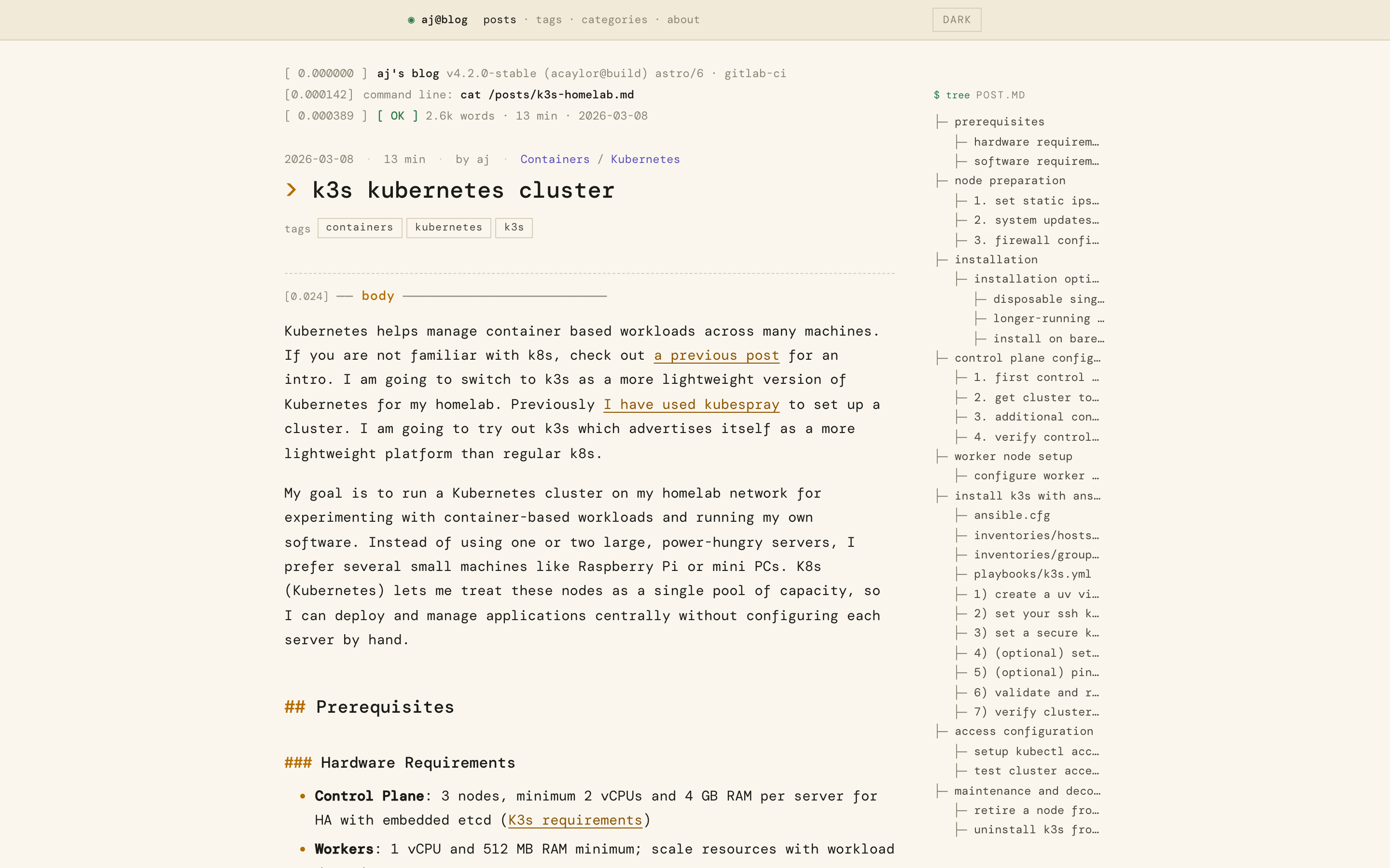
The table of contents uses the headings Astro already provides to the layout. On desktop it reads like a small tree output. On mobile it disappears, which keeps the post body focused and avoids a cramped secondary column.
Prose styling stayed fairly conservative. Headings get terminal-style prefixes, links use the stronger amber token, inline code gets a small bordered treatment, and blockquotes get a left accent border.
Code blocks
This blog has a lot of code examples and I want them to look presentable.
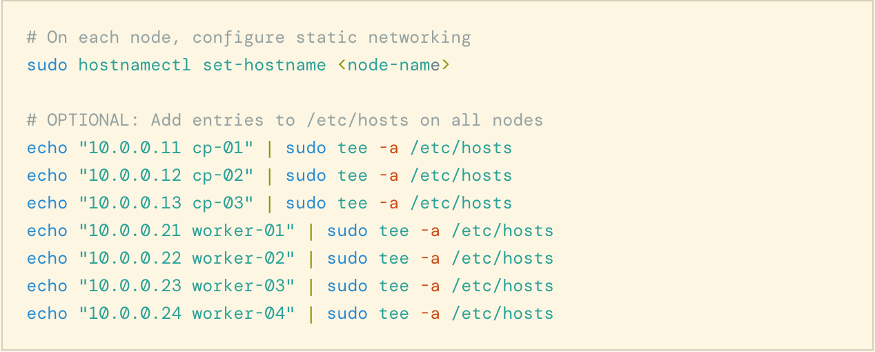
The final version keeps Shiki’s rendered output, adds a thin border, and uses Astro’s dual-theme Shiki configuration:
shikiConfig: {
  themes: {
    light: 'solarized-light',
    dark: 'monokai',
  },
}
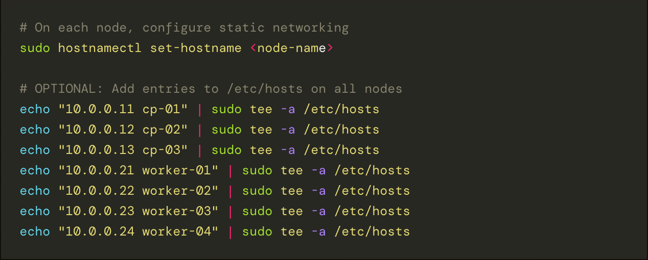
The copy button stayed, but it needed a small fix. It had been positioned inside the <pre> element. That works until a wide code block scrolls horizontally; then the copy button scrolls away with the code. The fix was to wrap each <pre> in a .code-block element and anchor the button to the wrapper instead of the scrolling element.
List pages
The old design used a lot of cards. The new design uses lists and tables.
The posts index is a compact row list with date, title, reading time, and tags. The tag and category pages use a small stat table with counts. The about page is a set of module sections instead of a loose collection of cards.
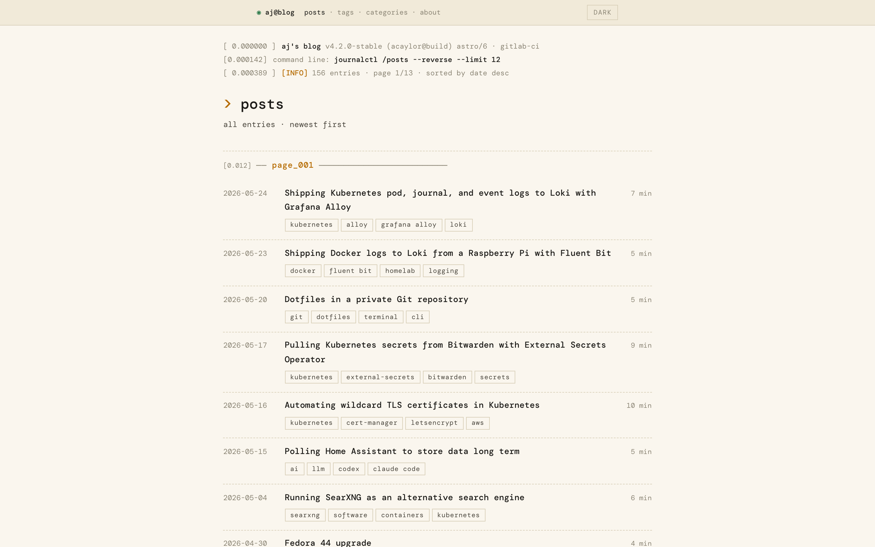
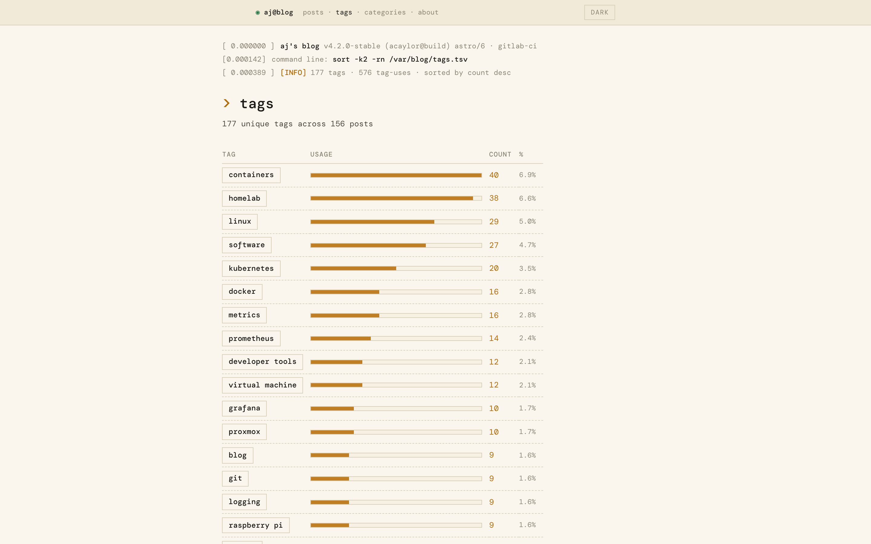
That change also made the site feel more like a tool and less like a product landing page. It is easier to scan, especially on archive pages.
Mobile work
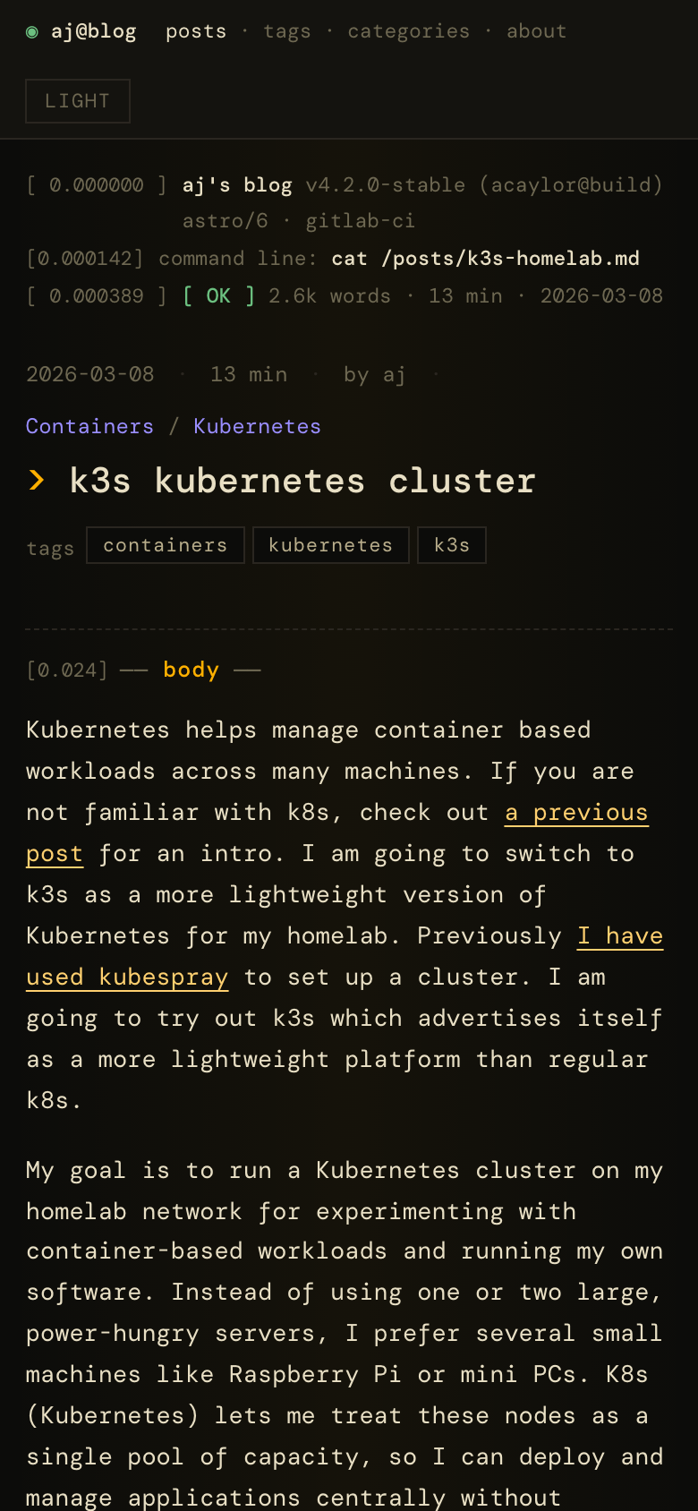
The mobile target was 390 px wide. That mattered because code blocks, tables, long tags, and generated headings can easily push a static site wider than the viewport.
The most important CSS fix was adding min-width: 0 to the right grid and flex children. Without that, a wide <pre> can force its parent column wider than the screen even when the code block itself has overflow-x: auto.
Code blocks now scroll internally, stat tables drop nonessential columns, module dividers shorten, and the pager uses a smaller range on narrow screens.
Screenshots
The screenshots in this post were captured with Playwright driving headless Chromium against npm run preview. I have been using AI tools a lot more lately and rather than collect screenshots of the redesign myself, I wondered if an AI agent could use Playwright and capture screenshots for me. The site does not depend on Playwright at runtime, and I did not want to add browser binaries to the blog’s dependency tree for a one-off image capture job, so the runner lived in a temporary directory outside the repo:
mkdir /tmp/screenshot-script && cd /tmp/screenshot-script
npm init -y > /dev/null
npm install playwright
./node_modules/.bin/playwright install chromium
I built the site first, then served the production output:
npm run build
npm run preview
# http://localhost:4321
Using npm run preview instead of npm run dev mattered for two reasons:
- the preview server serves the production-shaped output from
dist/ - there is no Astro dev toolbar overlaying the page.
A few details made the screenshots stable:
- Set
localStorage.themewithaddInitScriptbefore navigation soBaseLayout.astroselected the right theme before first paint. - Wait for
document.fonts.readyafternetworkidleso DM Mono had loaded before capture. - Disable the blinking prompt cursor before the screenshot so the image was not caught mid-animation.
- Use element screenshots for code-block close-ups and viewport screenshots for full page captures.
Here is an example of the script used to capture screenshots:
const BASE = 'http://localhost:4321';
const OUT_DIR = '/path/to/ajs-blog/public/images/dmesg-refactor';

async function makeContext(browser, viewport, theme) {
  const ctx = await browser.newContext({
    viewport,
    colorScheme: theme === 'dark' ? 'dark' : 'light',
    deviceScaleFactor: 2,
  });

  await ctx.addInitScript((t) => {
    try {
      localStorage.setItem('theme', t);
    } catch {}
  }, theme);

  return ctx;
}

async function shoot(ctx, path, file, opts = {}) {
  const page = await ctx.newPage();
  await page.goto(`${BASE}${path}`, { waitUntil: 'networkidle' });

  await page
    .waitForFunction(() => document.fonts.ready.then(() => true), { timeout: 5000 })
    .catch(() => {});

  await page.addStyleTag({
    content: '.prompt .cursor { animation: none !important; opacity: 1; }',
  });

  if (opts.selector) {
    const el = await page.waitForSelector(opts.selector, { timeout: 5000 });
    await el.screenshot({ path: `${OUT_DIR}/${file}` });
  } else {
    await page.screenshot({ path: `${OUT_DIR}/${file}`, fullPage: opts.fullPage ?? false });
  }

  await page.close();
}
For the mobile screenshot, I used the same flow with a 390 px wide viewport:
const ctx = await makeContext(browser, { width: 390, height: 844 }, 'dark');
await shoot(ctx, '/posts/k3s-homelab/', 'post-dark-mobile.png');
What CI caught
The CI checks from the previous post were useful almost immediately.
html-validate caught repeated landmarks without unique labels when the header, footer, share links, and table of contents were rewritten. It also caught new buttons without type="button" in the theme toggle and copy button work.
The link checker caught missing image references while I was adding the screenshots for this post. That is exactly the kind of issue I wanted lychee to catch: the site builds, the markdown looks fine, but some link is broken.
The checks did not catch everything. The amber link contrast issue needed a browser accessibility pass. The copy-button drift bug needed manual interaction testing. The timestamp columns also needed visual tuning so numbers did not jitter between rows.
What did not change
The refactor was visual and structural, not architectural:
- No new routes
- No client-side framework
- No analytics or comment system
- No content model changes
- No new runtime state beyond the existing theme preference
- No new runtime dependency
The only package addition was @fontsource/dm-mono.
Closing thoughts
The Astro migration made the site easier to change. The CI work made it safer to change. This refactor is the first larger payoff from those two pieces of work.
The result is still a static Astro blog, but it now has a visual direction that fits the content better. The main thing I would do earlier next time is run the browser accessibility pass sooner. The contrast fix was easy once I saw it, but it would have been better to catch before the palette felt settled.
I am thinking about adding end-to-end browser tests using Playwright but I do not feel the need for a static site (yet).
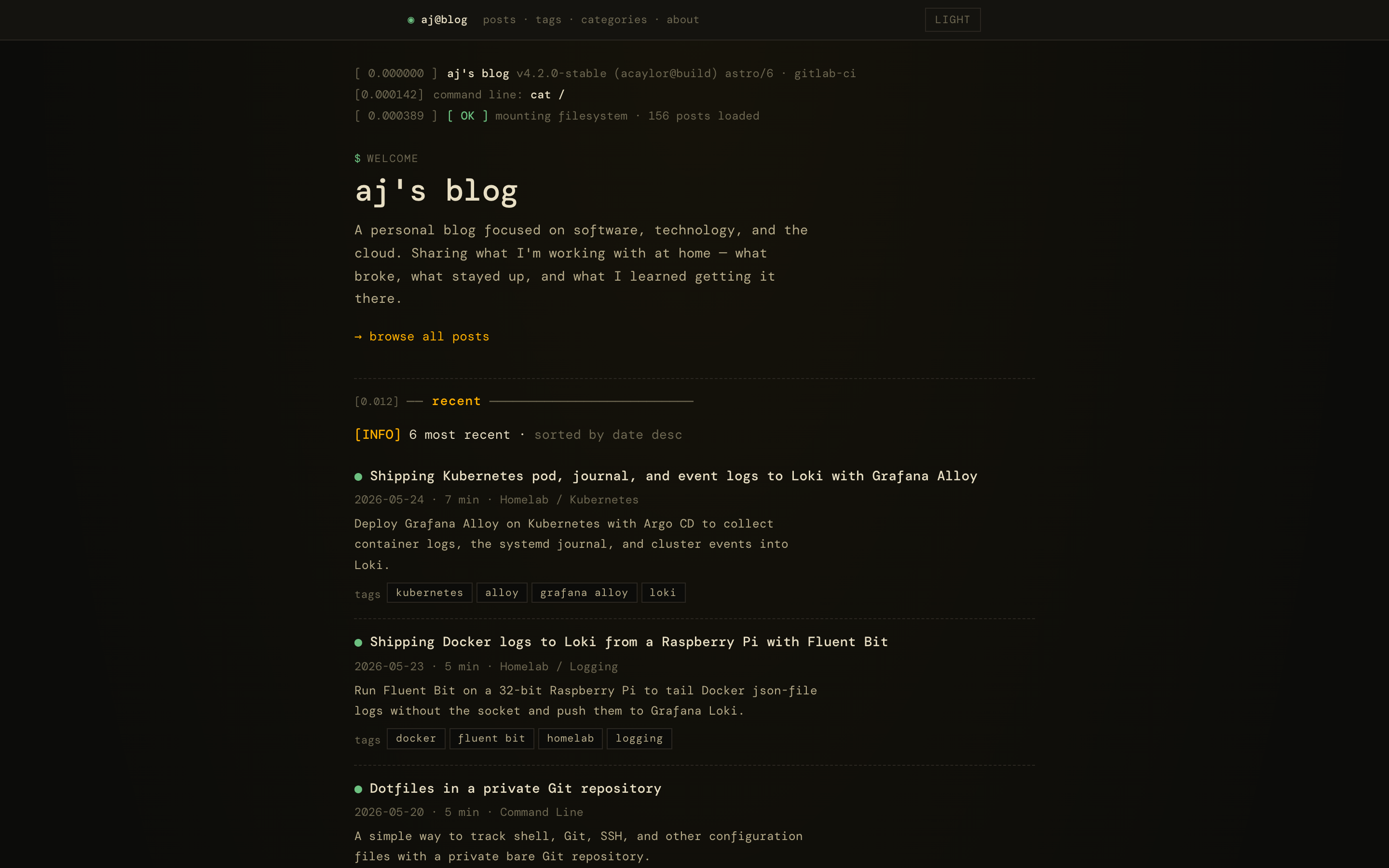
Here is a look at the landing page on dark mode:
The source is on GitLab and mirrored on GitHub.
Disclaimer: I used an LLM to assist with this work and post. Opinions expressed are my own.